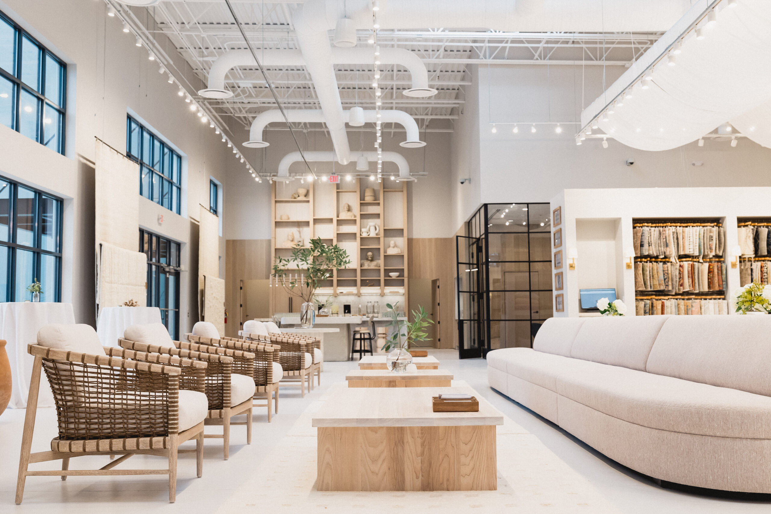
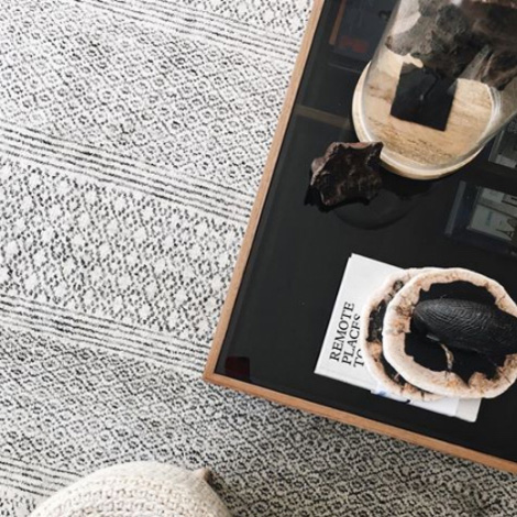
Part of the experience of design is tactile—clients love to touch and see the textures, surfaces, and finishes that bring rooms to life. In that spirit, Jaipur Living debuts the Jaipur Living Studio, a showroom and in-person experience for designers and clients alike to come and immerse themselves in the brand. Appointments are available now for booking.
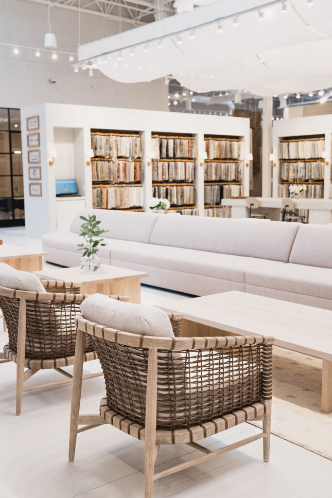
Jaipur Living Studio houses 18-inch swatches for the brand’s full assortment of rugs.
The Story
Says president Asha Chaudhary, “Our brand is all about human connection and bringing craftsmanship and the world of interior design together. Jaipur Living Studio gives us a physical place to foster those meaningful relationships and show the beauty of our product.”
Connection is the theme of the space, with emphasis not only on the physical items, but also on the team who helps bring the products to life. Housed in Jaipur Living’s Atlanta-area headquarters, Jaipur Living Studio is a place to get inspired. “We want the studio to be an experience,” says Chaudhary. “We invite all to use our space as a place to think, be creative, design, meet with clients, and present visions.”
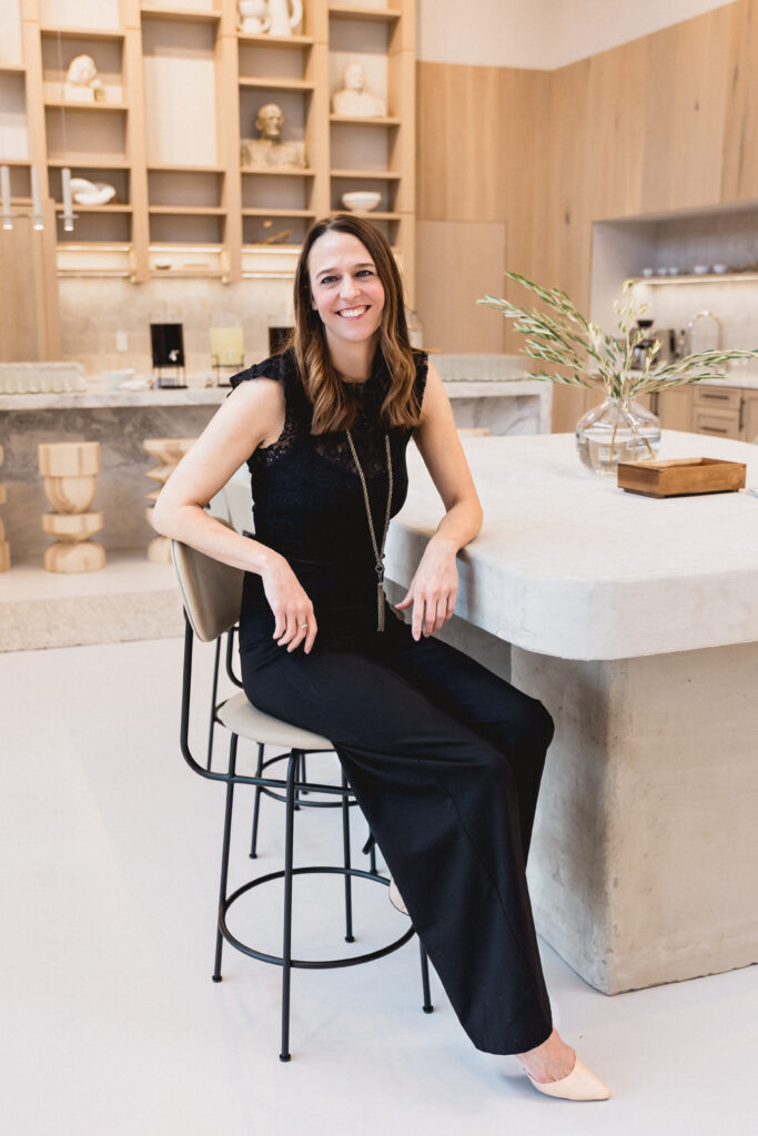
Interior designer Summer Williams imagined the space in collaboration with the Jaipur Living team.
The Inspiration
The designer behind the space, Summer Williams of Summer Williams Design, used Jaipur Living’s brand philosophy to direct her work. “It was very important that the space reflects the brand as a whole,” she says. In researching the company, the pieces that touched me the most were family, female empowerment, doorstep entrepreneurship, and new ways of doing old techniques.”
See also: Business Of Design: Interior Designs & The Storefront
She adds, “With two strong female leaders at the helm and multiple programs to enrich opportunities for women, the space needed to be bold, but simultaneously delivered with softness and subtle femininity.”
Another important highlight was craftsmanship, which translated to Williams as modern and fresh in tone, with an inherent restraint shown in its simplicity. “I wanted the craftsmanship of the products (patterns, textures, colors, etc.) to sing loudly above the showroom itself and for guests to feel inspired and engaged to what is possible within their own design schemes and ideas.” Using these principles as groundwork, Williams decided on an environment that felt both impressive, grand, and intimate.
The Space
Williams used this philosophy to center her design for the space. The first big hurdle: the sheer size. “When a room is quite large and tall in volume, it definitely is a challenge to embrace the grandiosity of scale without overwhelming guests,” Williams says.
While the intention of Jaipur Living Studio was always to showcase, it soon turned into more of an opportunity for hospitality, which means space planning would be “instrumental in positioning everything so that the room would unveil itself piece-by-piece,” she says.
See also: 3 Rules To Nailing Custom Furnishings
This was accomplished through flexible partitions, dividers, and display units. “Intimate zones feel more manageable to digest,” she explains—be it a retreat to the courtyard garden, a meeting in the conference room, or an interaction in the hospitality space. “The idea was to create a journey, where each path offers something a bit different to the next, yet all thread together through the balance of tones and complementary material selections.”
The entire assortment of swatch samples and a whopping 700 full-size rugs are available, as well as soft goods like poufs and pillows. The full range is available to view, including collections, new products, bestselling favorites, swatches, vintage rugs, one-of-a-kind designs from Manchaha, and edits from exclusive designer collections with partners like Barlcay Buetera, Kate Lester, and Nikki Chu. Williams utilized overall undertones of pink in paint and fabric choices, as well as flowing sheers to give the industrial space soft curves. “I often play with opposition,” she says. “For example, the zellige tiles are a handcrafted material, whereas the steel/glass are more industrial. Wood is a warmer material, and stone is a hard/cool material. All of these were selected to sit in adjacency within the same space, but how they are juxtaposed to one another is how the harmony and balance are created.”
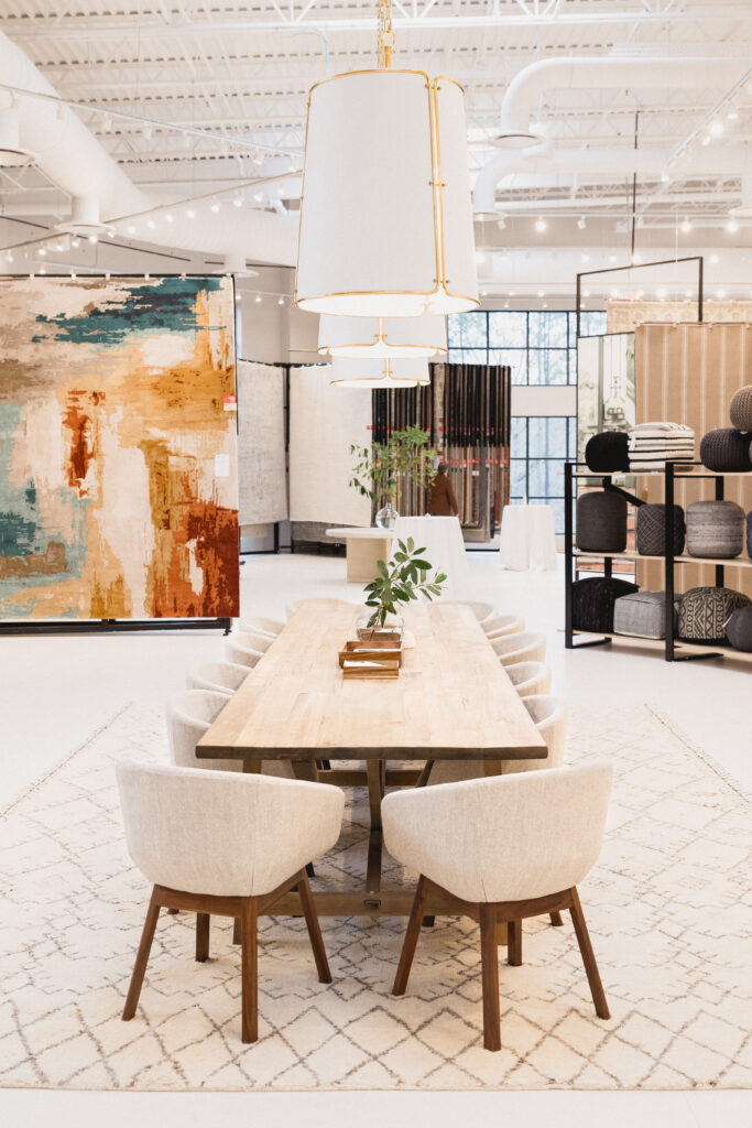
A lengthy table provides ample space for client-designer meetings. The Genesis collection’s Swisher rug is at left, poufs are at right, and the Zuri collection’s Zola rug sits under the table.
The Challenges
Williams’ first big challenge was volume—“One decision makes a huge impact when rolled out to a sprawling 15,000 feet,” she says, noting that it’s equally frightening and exciting as a designer.
The other is products that range in scale, from as small as 14 inches to as large as 14 feet. The breadth of products requires different parameters for display. “The dramatic variance in proportion did pose an additional design challenge to accommodate all with an equal measure of importance,” says Williams. She achieved this through careful planning. “We created the various zones for showcasing the products (large rugs, small pillows, poufs, and so forth) and while everything is somewhat open, the delineation was in large part resolved through the design of custom shelving units and flexible racking.”
See also: 6 Secrets To Staging Perfected
Another challenge was knowing that her peers would be in the space. She wanted to create a setting that felt intentional to the brand yet ambiguous enough for designers to impart their own visions onto it. “I hope that this will not only be a calming environment, but one where designers can see the products within a bit of a blank canvas and allow their imagination to wander,” she says. “Thinking about all the creative ideas that will result from the time spent within this room is perhaps the most exciting part.”
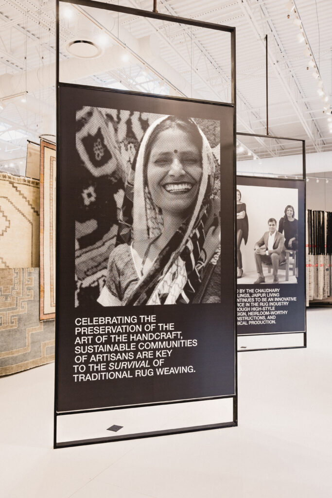
Throughout the Studio, Jaipur Living‘s unique brand story and work with artisans in India is showcased. The Cyprus collection peeks from behind the vignette.
The Details
The powder rooms and kitchen area both received particular attention as high-traffic, high-impact spaces. “I wanted the bathrooms to be individual rooms that evoked the feeling of a powder room versus a commercial restroom,” Williams says. She achieved this by going bold in color and tone for contrast. Some of the materials are repeated here, such as zellige tiles and concrete, but the palette is darker. “I wanted to invert to a deep, dark hue to make the space feel more intimate and enclosed,” she says.
See also: 6 Design Trends Taking Over In 2023
In the kitchen, Williams drew inspiration from the old adage that the kitchen is the heart of the home, creating a focal point around it. “One of the collective goals in design and functionality was to create a destination that felt welcoming and enjoyable, yet equally dramatic and exciting for Jaipur Living customers and partners,” she says.
She wanted to emphasize the vertical nature of the room, which she did by creating shelving up the back wall. “Not only as a place for Jaipur Living to display special objects, but it’s adding architectural interest,” she says. The counter was designed with a modern chamfer detail and is done in a Brazilian quartzite stone called Calacatta Bianchi, and she added wood for warmth. “The handmade zellige tiles add a more human touch to an otherwise clean-lined detail,” she says.
Jaipur Living Studio is now open Monday to Friday, 9 am to 5 pm. Appointments can be booked via email at [email protected] or online.
Next story


