3 Steps To Mastering The Trend: Getting Spicy
Design is heating up as the trend tide turns to richly saturated colors inspired by spices.
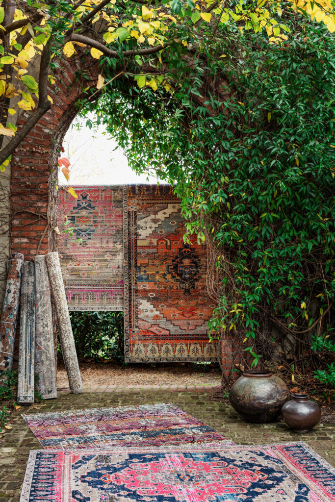
Cranberry, turmeric, paprika—saturated, spicy colors are heating up the design world as both a statement-making bold choice from which to launch a room and a powerful punch in accents. Jaipur Living checks in with four designers to see how they approach the spicy-hued trend.
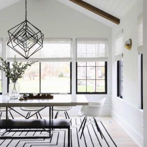
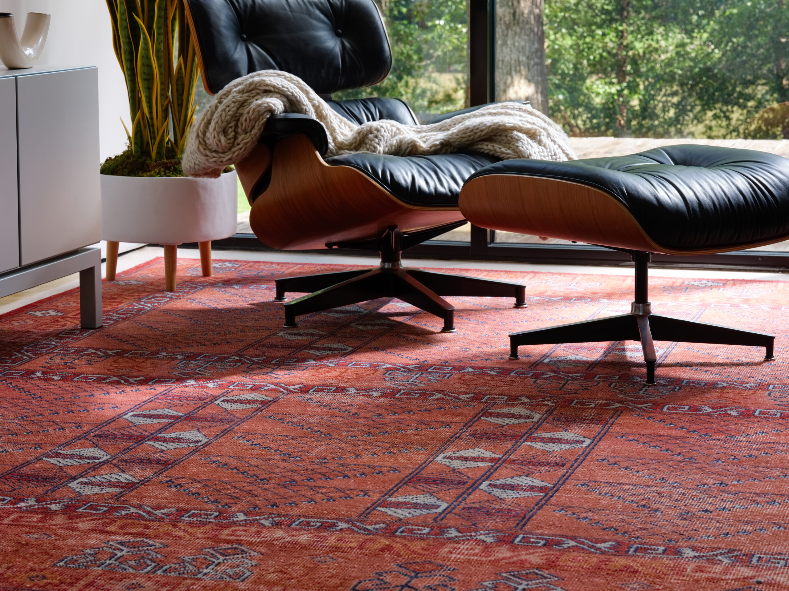
Jaipur Living‘s Prisma rug is easy care and kid and pet friendly.
Getting Warmer
Julia Longchamps of Julia Longchamps Design is feeling spicier colors beyond just traditional use in fall decor schemes. “It feels cozy, lived-in, and comfortable,” she says. “I am loving all of the warm earthy elements that are making their way back into design.” Adds Alisha Taylor of Alisha Taylor Interiors, the switch-up is here to stay. “The warmer palette is a welcome offset to the all-white and gray trends of yesterday,” she says. “We have come to really appreciate our homes and what our environment can do for our mental health.” She explains that warm, inviting colors in this color scheme work great for livable spaces—whether a big family estate or a small high-rise condo. “These colors add depth and dimension yet are still neutral enough that they don’t wear on you,” she says, noting that she finds herself going to these colors more and more.
See also: 3 Steps To Mastering The Trend: Into The Deep
For some designers, like Anna Wooten Loggins of A. Wooten Interiors, these deep colors aren’t de rigeur. But designers like a challenge, especially in deference to their client’s tastes. Take, for example, a recent client request to incorporate purple tones, a color she doesn’t often use, for a formal living room. “By using a deep cranberry with pops of coral balanced with some cool green tones, it made for a beautiful and inviting space,” she says.
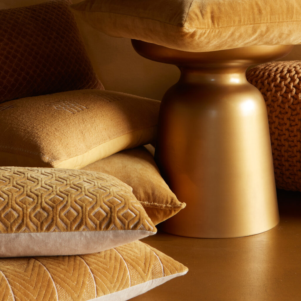
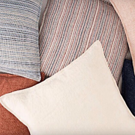
Marigold pillows, like the Nouveau collection, provide a spicy punch to interiors.
Step One: Start with Texture and the Right Tones
Taylor says that it’s imperative to have texture when using this spicy color palette. “Mixing and matching textures adds the extra depth and drama this softer palette needs to still make a statement,” she says. Longchamps notes that regardless of any color palette, a good rule to live by is starting with a strong textural neutral base. Loggins likes to consider the window treatment fabric first, using it to build the palette. She also says the tone of spice-inspired colors needs to be specific: “I always want to use a spicy color that has a brown undertone as this helps neutralize the color.”
See also: 3 Steps To Mastering The Trend: Natural State
If the entire thing feels simply overwhelming, Loggins recommends starting with a fun pillow with a spicy contrasting welt. “Pillows are a great way to explore a trend without making a big investment. Using warm tones on a cool backdrop (like a blue sofa) creates a fun pop of color and makes the space both fun and interesting,” she says.
Jaipur Living‘s indoor/outdoor Swoon collection
Step Two: Examine Your Furniture
Furniture needs to be carefully considered to make sure that there’s a balance. For Loggins, antiques do the trick. “We recommend incorporating antique pieces to create warmth and sophistication when the color palette is especially bold,” she says. Taylor adds that the palette is natural and inspired by nature, so there must be always elements derived from Mother Nature—whether it be warm-toned woods, a quartzite slab, leather, or another element.
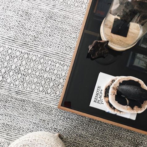
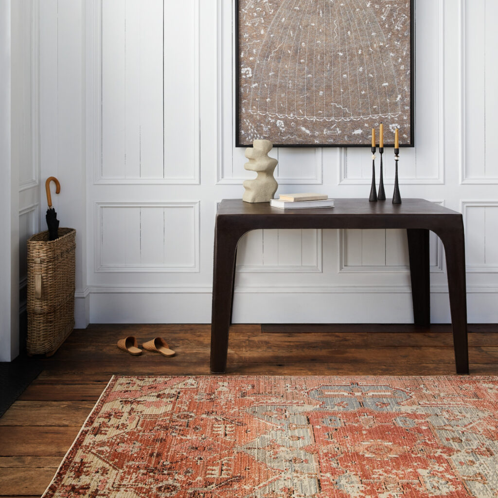
Spicy hues from the Polaris collection
Step Three: Layer
Taylor says the real magic with the spicy trend happens when you layer in this palette. “It’s best achieved by looking at all of the layers of design and making sure the eye has many different layers to peel back and appreciate,” she says. “This palette works best when you aren’t just stuck on one spicy color. It’s meant to be an entire palette,” she says. She recommends using several bold colors together, like cinnamon, butternut, and sage. “They’re meant to act as a team and work together.”
See also: 3 Steps To Mastering The Trend: Urban Curator
Ruchi Agrawal Mohan of Design by Ruchi likes to use pops of warmth in rugs and accents like flowers, throw pillows, and deep-colored stones. “ Remember to balance the use of color with some texture and pattern and some negative space. Maintaining balance is the key,” she says. “I like a good mix of scale, pattern, materials, and textures are important to create a well-curated space.” Longchamps has a similar strategy: She incorporates throws, pillows, rugs, and accessories in a color palette. “The easiest way to refresh your place is to bring in new throw pillows. Layered patterns and colors are impactful to a space.”
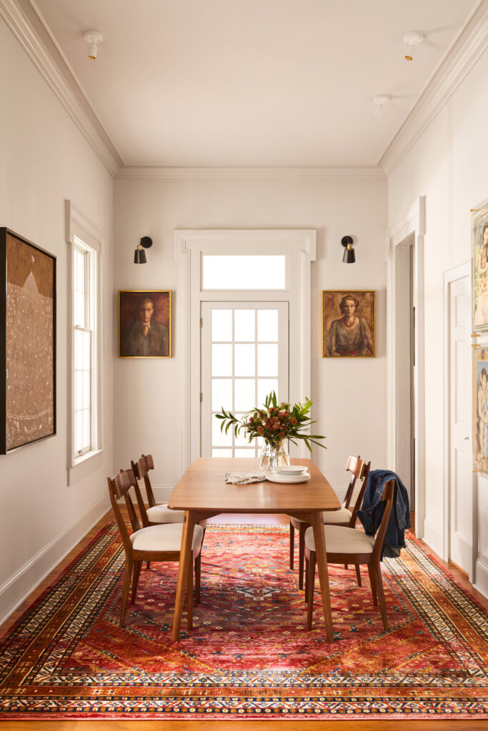
Part of the interior designer-exclusive Designer Edit program, Someplace in Time features traditional motifs in warm colorways.
Other Considerations
Loggins says balance and contrast are key to pulling off these colors. “People sometimes forget to balance the spicy color palette with cool or neutral tones. Even for clients who love color that background is a necessary anchor to really showcase your picks,” she says. Longchamps agrees that it takes a certain balance to pull it off. “Avoid overly saturated colors. These can feel harsh especially if you are trying to blend new colors into your current decor,” she says.
Mohan advises having open lines of communication with clients who want this color scheme. “Make sure you understand your clients and their preferences,” she says, “then decipher if the client likes warmth in small doses, like pops of color, or if they prefer saturated colors and bold rooms.”
For Mohan, it’s hopefully the start of a new color palette dominance: “I’m hoping turmeric and cranberry can become a new neutral just like we saw with blue, green, and blush in the last few years and people become more accepting of these colors as they see these colors being used more in professionally designed spaces,” she says.
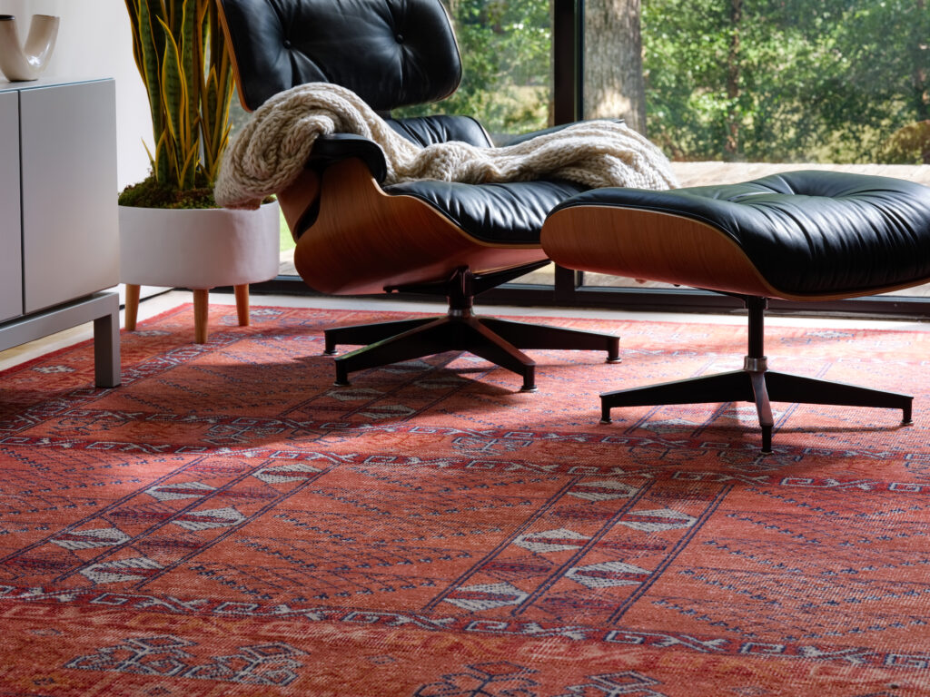
The bestselling Gallant collection speaks to the Getting Spicy trend.
Get The Look
Loggins’ Picks
1. “Layering wool rugs like Jinsen in a spicy color is a great way to include this color palette. This rusty wool rug will bring warmth and texture to any space. Again, it’s just about balancing these tones with something more neutral on top.”
2. “This bold red with greek key detail on Revolution has an antique look and would look beautiful on its own or layered over a neutral sisal.”
3. “A linen throw like Madura in this rust tone brings a pop of color to any neutral sofa and makes the space feel cozy and relaxed.”
4. “A neutral wool rug like Enclave lends itself to adding a colorful upholstered furniture piece on top.”
Taylor’s Picks
1. “We love the repeating pattern design on Pathways. The color of this specific colorway is stunning and very spicy.”
2. “We love the beige pillow fabric on Allura, as it pulls the softness of a neutral palette with a little bit of viscose texture, great for layering.”
3. “Armour is a fun, spicy-colored lumbar pillow that adds a little bit of drama without it speaking too loud and will be the perfect addition of color and texture to a sofa or chair.”
Mohan’s Picks
1. “I love the Jaipur Wunderkammer rug, which brings in the ochres paired with a playful pattern set inside gray borders… a very modern and contemporary rug. It can look beautiful paired with an ochre sofa and gray lounge chairs and a white marble table giving the room a whole lot of impact and sophistication.”
2. “I like the deep colors in this Manchaha rug to ground the room. I would love to see this rug in a room with cerused light oak floors to create contrast. Place a sectional in a dark gray or navy with lots of similar colored textured throw pillows. Add light camel leather chairs and a black coffee table. Walls can be light or dark based on client preference and add some golden art to bring in opulence.”
3. “Given the Polaris is more traditional in its weaves, I want to show off more of it. I’ll use a glass-top coffee table and bring in some oatmeal pieces in here with lighter walls.”
Longchamps’ Picks
1. “I love Someplace in Time! It is warm and incorporates warm tones, but doesn’t slap you in the face with powerful color. This rug is transitional and would look fabulous with a neutral cream sofa and wood accents, or even a colorful pattern upholstery. It’s very versatile.”
2. “The Madura throw is a nice way to bring in some terracotta colors. It will look great draped over your sofa layered in with some pillows. Or over your bed to add some color and texture.”