While designers don’t kowtow to fleeting trends, they are acutely aware of adjustments in attitudes, cultural shifts, and their clients’ needs. Here’s what six designers told Jaipur Living will be top of mind in 2023.
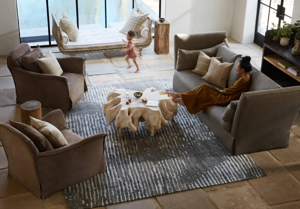
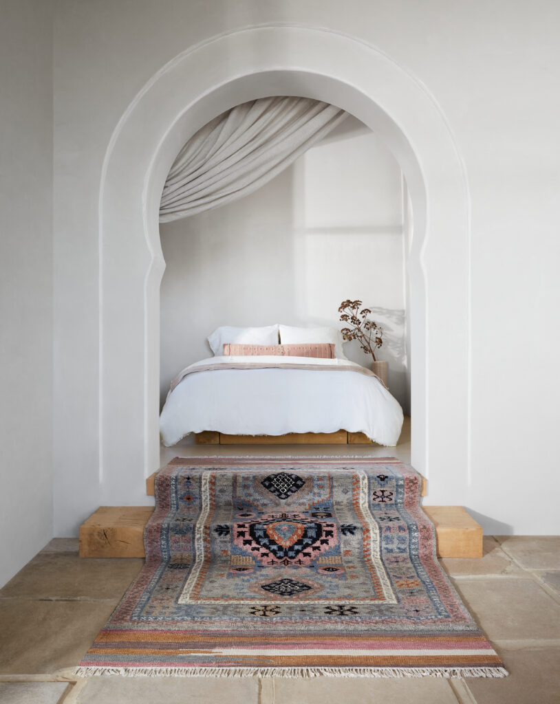
The hand-tufted Pathways collection by Verde Home from Jaipur Living
Feeling Good
Says Kami Gray, founder of Kami Gray Interiors, clients are moving toward rooms that create a feel good experience. “We’ve been overthinking it and have been way too serious about our homes,” she says, referencing that the pandemic, a looming recession, and a “general sense of trying too hard” could be contributing factors to a more relaxed attitude. “We’re about to get less intense and create homes and rooms that are meant to be lived in and make us feel good.”
See also: 5 Renovation Trends To Watch
Gray notes her clients are asking for fun and comfort over conforming to design standards. “They’re looking for a sense of ease,” she says, which she’s accomplishing through soft, blanket-like rugs layered with an oversize colorful rug, for example, or through the use of playful palettes. “Clients want their home to take the edge off their busy, productivity-centered lives. They want to be able to immediately switch gears,” she says.
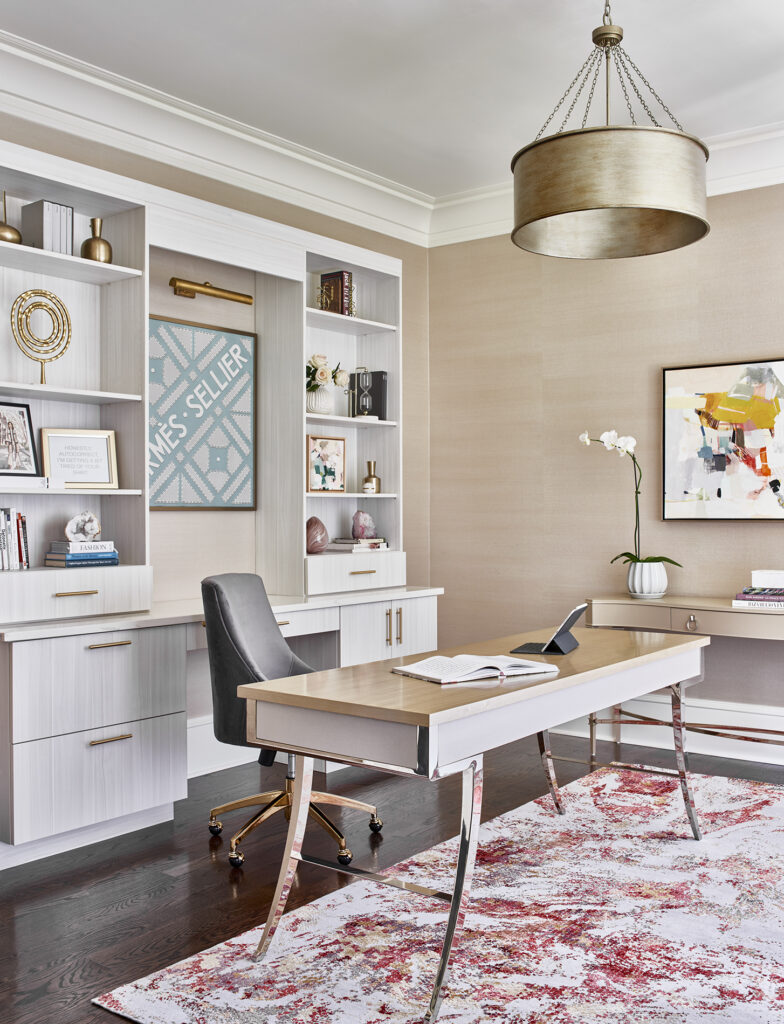
Form and function combine in this office designed by Imani James, which feature the Unstring collection by Kavi. Photo by Marc Mauldin
Designated Functionality
Imani James of Imani James Interiors says there will be a continuation of putting even more functionality into a home. “We’ve certainly observed an increase in our clients’ desire to make each room in their home more functional,” she says. “The clients we work with are no longer interested in having pretty rooms filled with beautiful furniture to be used only during special occasions.” That translates to turning unused guest rooms into home offices or libraries and empty loft spaces into yoga rooms or games rooms.
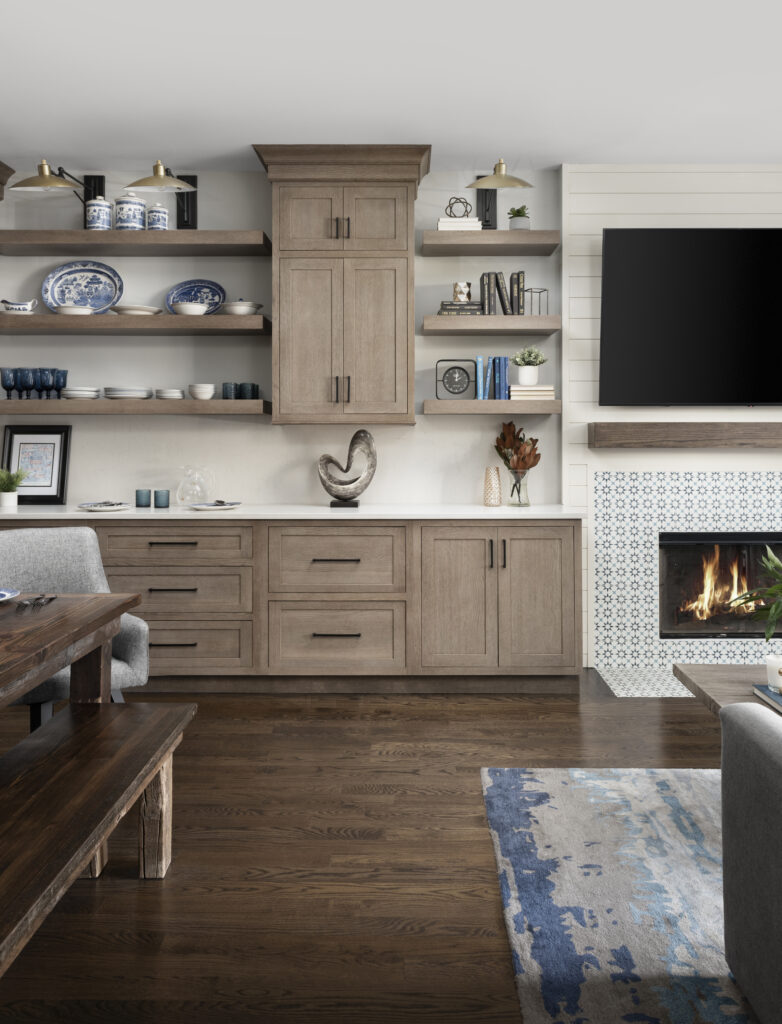
The bestselling Genesis collection has pride of place in this Chad Esslinger Design living space. Photo by Picture Perfect House
Multifunctional Matters
Chad Esslinger of Chad Esslinger Design sees it going one step further, with spaces becoming multifunctional. “People have already decided to invest more in their homes,” he says, “and now they want to give more purpose to each space. A living room is not only a place to entertain, but also a place to sit quietly before or after a long work day.” He says that the same space might also function as an office if someone wants a change of scenery. That comes to fruition through more intentionality in seating and floor plans, so there are accommodations for all potential configurations. “People are also asking for storage furniture that is both functional and beautiful,” he says.
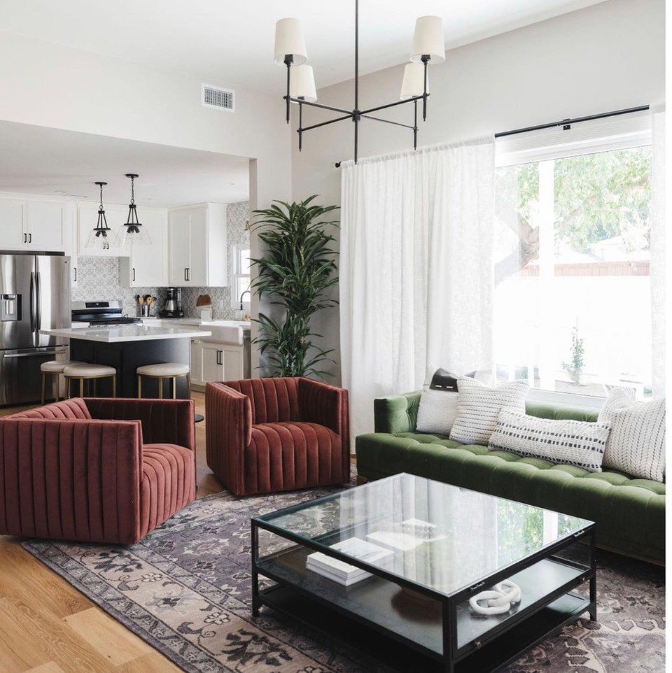
Ariana Lovato adds a dose of color to this living room with jewel tone furnishings and a classic twist with the Salinas collection from Jaipur Living. Photo by Lisa Maksoudian
Strength in Color
Ariana Lovato of Honeycomb Home Design echoes Gray’s notes of playfulness. She’s seeing it in color. While the past few years have veered strongly toward neutrals, calming colors, and monochrome palettes, she’s seeing an uptick in saturated hues. “Just like any other drastic shift, the pendulum is going to swing the other way, “she says. “Bold, jewel-toned colors are taking the forefront, while interior wall colors will stay the neutral backdrop.” Her clients are asking for color more and more—even if it’s just a splash. “We are rarely doing white kitchens anymore,” she says. “Color is back and we are here for it.”
See also: 2 Interior Designers Reveal The Rules To Pattern Play
To achieve this, layering is key. “The best way to incorporate these color tones is to layer patterns and textures and pick one to two bold colors to be the star of the show,” she notes, such as deep emerald and deep burnt orange, grounded with a more neutral Salinas rug. For Lovato, rugs are often a starting place. “Once we find the right rug, it helps pull together the other furniture pieces. With these rich tones, I find rugs that have colors that I want to incorporate in it, or I look for neutral so I can go bold with furniture color selections,” she says. Adding fabric textures, like velvet and boucle, then adds to the layering.
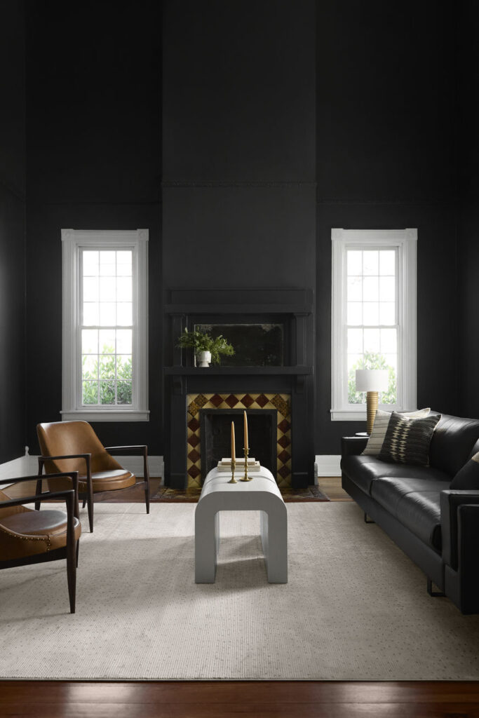
A moody backdrop for Jaipur Living‘s Sundar collection
That’s Rich
Bria Hammel of Bria Hammel Interiors is excited to see darker, more rich neutral palettes. “They have darker, richer tones,” she says, “like chocolate browns, deep camels, burgundies, and beiges.” She likes them because the colors are warm and welcoming. “This seems fitting as people feel more and more comfortable hosting friends and family in their homes again this year. We’ve seen such an emphasis on entertaining lately, and this color palette symbolizes that.”
See also: What’s Trending In Modern Design
Hammel says her clients in particular are asking for richer stains in their wood floors and darker cabinet colors that have more contrast. Contrast is of utmost importance to her. “While moodier colors are trending, I think it’s important to still have contrast in a space,” she says. “For example, if the floors are light, maybe the walls are dark, or vice versus.” She also thinks there will always be a focus on designing warm and cool colors together in a space. “It keeps the room timeless and full,” she says, noting that in the past spaces with all cool or all warm colors—i.e. all greige—go out of style more quickly.
Curve’s the Word
Curves seem to be here to stay for a while, at least according to Becca Reynolds of Becca Reynolds Interiors. “I’m still seeing a lot more organic shapes in furniture,” she says, which signals to her that the consumer is becoming more aware of form, not just function. “There seems to be an emphasis on hand-sculpted pottery, curved sofas, and other small furniture pieces with curved or rounded edges,” she says. It’s not only regulated to furniture, however. her clients are asking for arches and curves in doorways, range hoods, fireplaces, and windows. “Curves are a simple way to take a standard space and elevate it,” Reynolds says.
Next story


