3 Steps To Mastering The Trend: Into The Deep
Moody blue hues evoke mystery and serenity in this bold design trend.
Dark, moody blues—from enchanting indigo tones to shades of rich navy—are having a moment in modern interiors. Reminiscent of midnight skies and ocean depths, the aesthetic adds dimension and drama while instilling a sense of quiet calm in any space. Here, Jaipur Living breaks down the alluring trend with help from three design industry pros.
A moody blue moment courtesy of Jaipur Living‘s Pathway collection by Verde Home
Step One: Base
“Blue provides a wonderful springboard of color and is a classic color that has almost made its way into the ‘neutral’ color palette for interiors,” says Rainey Richardson, owner and principal of Rainey Richardson Interiors. And while all blues are timeless, it’s the deep, inky ones that are currently captivating the design world.
The appeal is understandable: Dark blue feels equal parts calming and cozy, moody and mysterious, sleek and sophisticated. The palette also complements a wide range of decorating styles and can be implemented in myriad ways, from walls and millwork to accents such as area rugs. “In a more traditional setting it’s that moody charm that’s fit for the coziest of family settings,” says Z & Co Design Group CEO and principal designer Heather Zamonis Eason. “In a more modern space, it’s that deep ocean blue that flows throughout the space and piques your interest in the perfect spot.”
See also: 3 Steps To Mastering The Trend: Urban Curator
Just like with any trend, test the waters first before diving into the deep end of the color spectrum. “Trends are tricky. One’s style should revolve around the season of life one is in,” cautions Nicole Roe Design owner and lead designer Nicole Roe. “Do you need light and airy or can you settle into a moodier vibe?”
But if moody blues are a fit for the space, embrace the look and allow it to guide your vision. “Be brave and go with it,” Richardson says. “You’ll be glad you did!”
Nicole Roe Design embraces a moody vibe with a rug from Jaipur Living’s Swoon collection, which features deep blue among other rich hues for a statement-making colorway. Photo by Lexi Wharem, Greenprint Photography
Step Two: Blend
Before settling on the perfect shade of deep blue to incorporate into a space, consider the various colors and their connotations. Each hue boasts a warm or cool undertone that can affect how an interior feels in subtle yet significant ways.
See also: 3 Steps To Mastering The Trend: Natural State
While a rich, saturated color like indigo can make a bold statement in the right setting, it is often the more muted, murkier blues that blend in hints of gray or brown that feel the most natural and luxurious. “We love a good slate gray-blue because we find it works well with many home styles,” says Eason, citing Sherwin-Williams Charcoal Blue and Software as recent favorites. Meanwhile, Roe tends to embrace toastier shades of blue. “Get it muddy,” she advises, especially when it comes to paint choice. “The addition of brown tones within the paint allow for the paint to shift and not overwhelm the senses.” Her go-to hue? “Waterloo by Sherwin-Williams,” she shares.
Ultimately, “Into The Deep is all about nuance,” Roe continues. “As the day progresses, colors shift and moods change. The tones should provide comfort and allow one to relax.”
Step Three: Balance
Dark blue achieves the same dramatic effect as black but with less intensity. “I define the Into The Deep aesthetic as a design that has extreme visual weight with space to exhale,” explains Richardson. “Traditionally, black would be the choice for this design, but rich blues can take you to the same place without the rigidity.”
See also: Finishing Flourish: 4 Guidelines To Accessories Styling
Because of that weight, however, contrasting the tones with lighter elements is perhaps the greatest key to perfecting the dark, moody look. Bring in warmth through wood furnishings or try incorporating woven accessories and plush textiles for an air of openness and softness. “It is important to make certain the lighting in the room is sufficient and on dimmers to create just the right balance,” adds Richardson. “I also like to include a least some soft neutrals in the space to counter-balance and enhance that richness the blues bring.”
Eason agrees that neutrals are essential to making a deeply hued room truly shine. “Keeping home finishes neutral while pulling color in rugs, pillows and other furnishings is always the best and most timeless play,” she says.
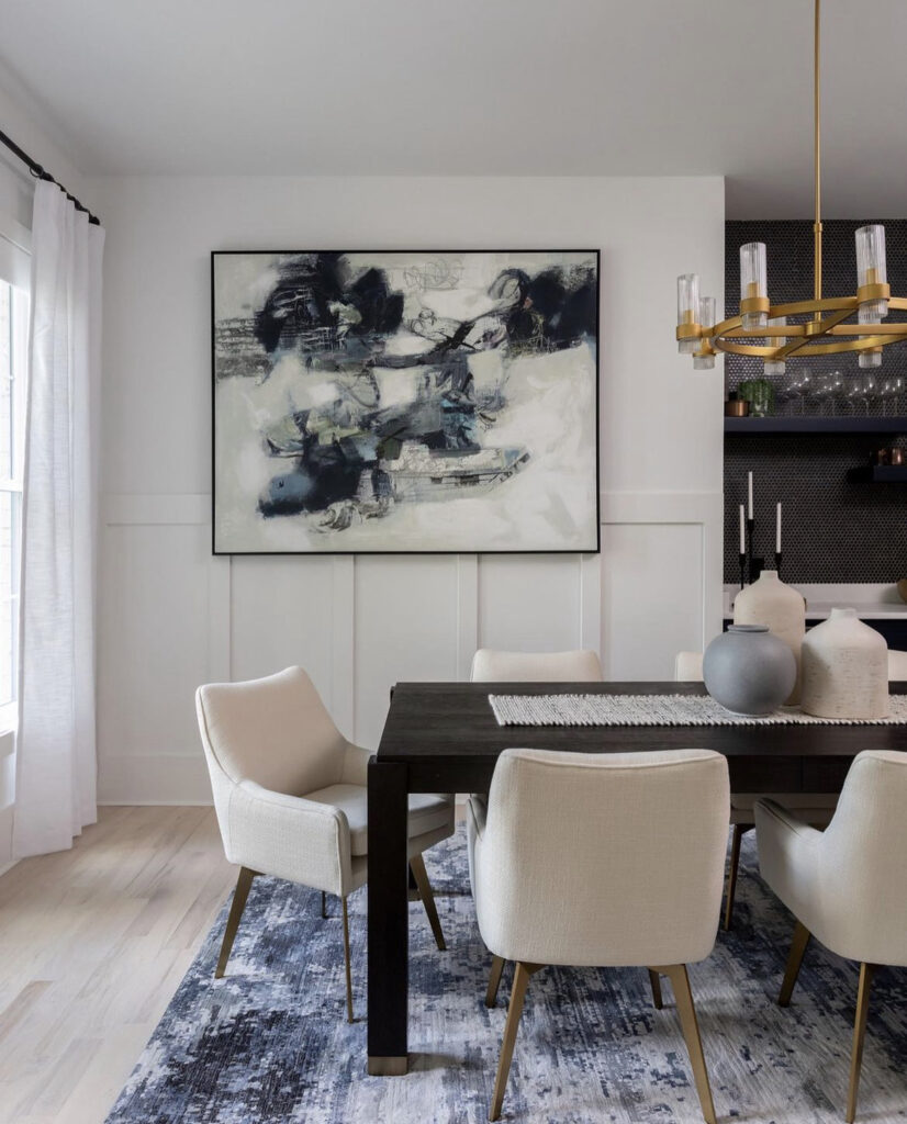
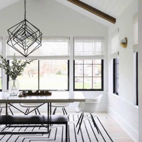
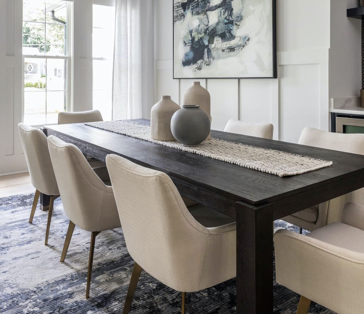
Jaipur Living’s Dash rug blends stormy blue, gray, and white tones to perfectly complement this modern dining room by Z & Co Design Group. Photos by Heidi Harris Photography
Get the Look
Embrace the dark side with these marvelously moody Jaipur Living rugs selected by our experts.
Heather Zamonis Eason
“We personally love the Dash, Rize, Solene, and Vindage collections.”
Rainey Richardson
“Liberty and Caicos in the blue colorways are a few of my favorite Jaipur Living rugs for this trend.”
Nicole Roe
“The Swoon series is the perfect balance of rich tones with a relaxing vibe.”
The hand-knotted Urban Pause is part of the interior designer-exclusive Designer Edit program from Jaipur Living.