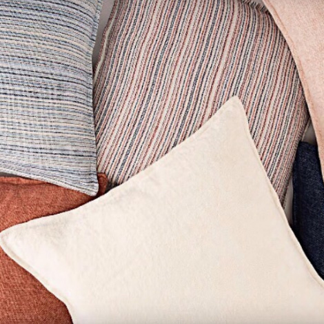
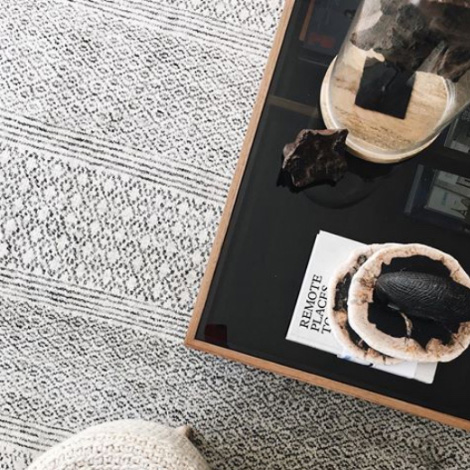
So much planning goes into the architecture, layout, placement, and furniture of a room design, but an oft-overlooked yet critical piece are the accessories. The styling of home decor is just as important as choosing the right accents. Here, two design firms share what they’re seeing in home goods and accessories—plus how to make the styling feel intentional.
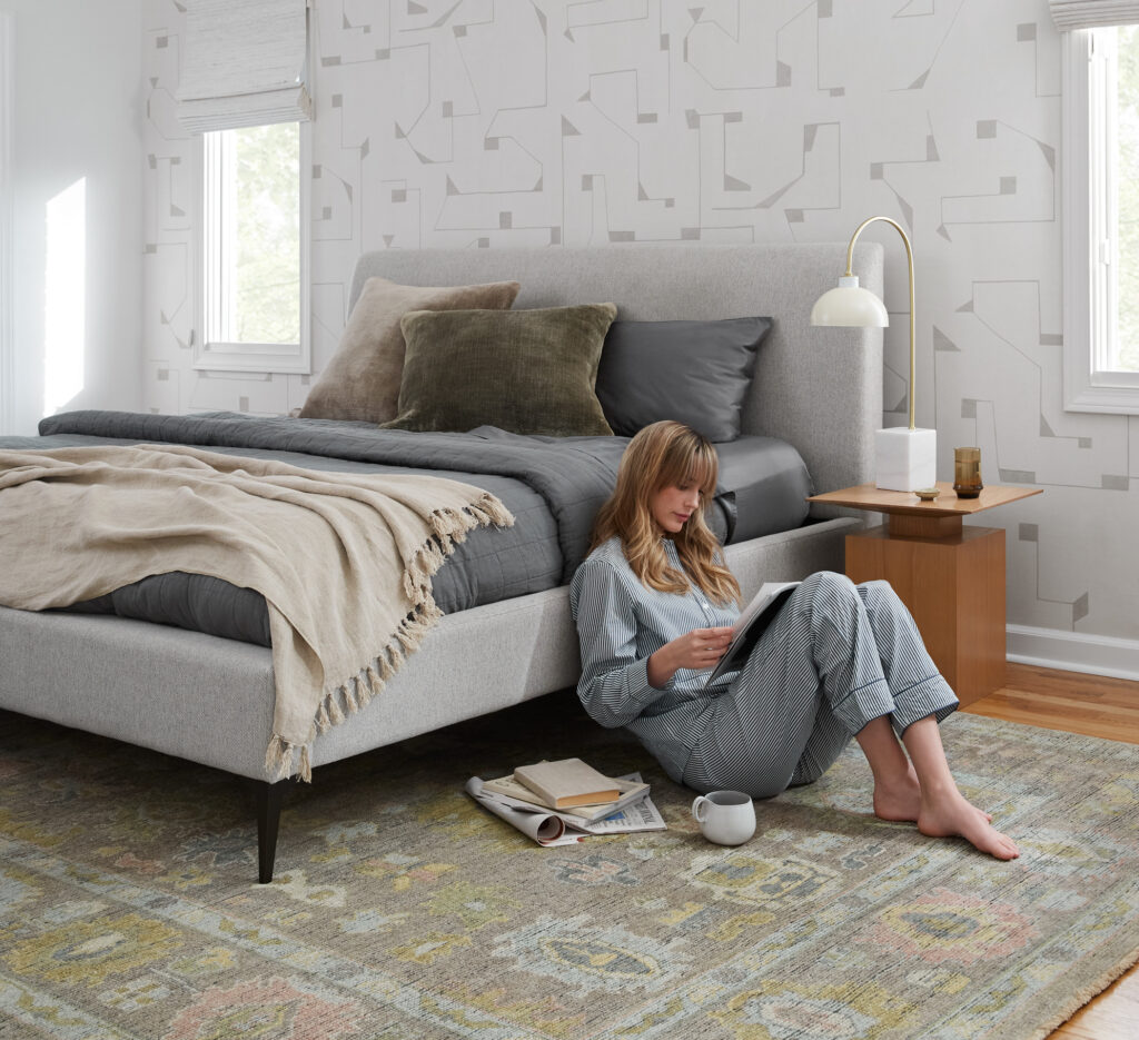
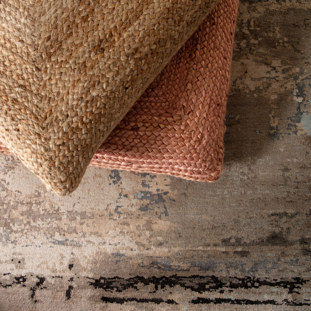
Jaipur Living‘s hand-loomed Allura pillows—part of the Designer Edit program—are made from 100% viscose for a luxurious sheen. Also seen: the hand-knotted Everly collection
“Accessories help to bring a space together and paint the whole picture,” says Alyssa DeBord, co-founder with Lori Hojnowski of events and event design firm Shannon Paige Events. “They’re essential to bring the area to life.” Think of home accessories like you would clothing accessories, adds interior designer Hope Austin of Hope Austin Interiors LLC. “It’s like adding jewelry to finish off your outfit,” she says. “By using some interesting pieces, you can help pull together a space and connect rooms.”
It’s all about the intent, according to DeBord: “Accessorizing from the ground up allows our clients and guests to take in and visualize the space and see the overall theme.” Here, Austin, DeBord, and Hojnowski break down the rules of engagement for adding the final finesse to their interiors projects.
Currently Coveting Texture
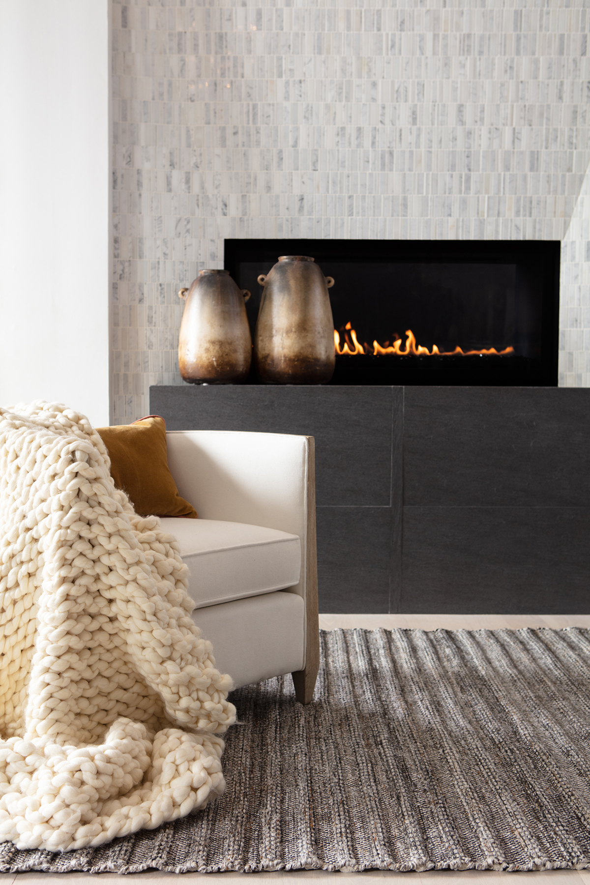
Austin notes she’s seeing a lot more organic elements, such as wood and pottery, which provide deeper textures and look more organic and rustic. “It’s different than the gold and brass that was so popular a few years ago,” she says.
Texture is highly important to the feel—and look—of a room these days. “It’s just as important in creating a mood as a color or a print,” Austin says. “While I do love a good print (or five), I’m a big fan of a simple color palette that’s rendered in a variety of different textures, such as pillows in linen, velvet, and a woven texture. A similar color family allows it to provide a lot of impact without being busy.”
See also: 4 Ways To Elevate Interiors With Unconventional Materials
Hojnowski, whose interior design firm also specializes in event design, agrees that texture is key—whether designing a permanent room in a home or a temporary one for an event. “The texture of an accessory can completely change its effect on the space,” she says. “Texture creates more depth and character. In addition, the texture of an item helps us to properly portray to the guests and clients the theme we are going with,” she continues. “For example, when we’re hosting evening events, we have more gloss-textured items that will catch and bend light. But when we host day garden events, we lean more toward matte and heavily textured items that will not catch light, but rather absorb it and blend in with the surroundings.”
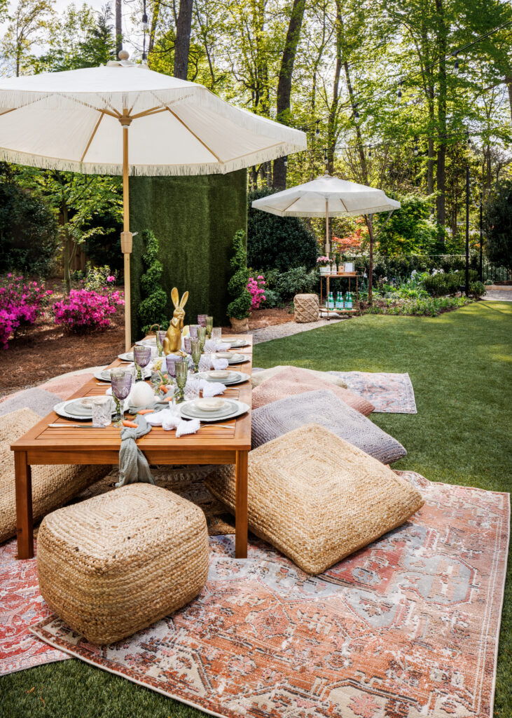
This Shannon Paige Events alfresco scene features Jaipur Living indoor/outdoor rugs and the Saba pouf. Photo by Lauren Chambers
Rules of Engagement
Accessorizing encompasses everything from rugs to art to objects to soft goods like pillows, poufs, and throws, so you need to consider the entire room and its elements before adding the finishing home goods, says Austin. “If you have a large bookcase on a wall,” she says, “then you may play up how you accessorize the shelves while toning down some of the other areas. You don’t need a wall full of framed art or photography if it will compete with your shelves.”
Visually, people find odd numbers of items more appealing and interesting, and that principle also applies to interior design. “Your eye moves around more when viewing odd numbers because there is a lack of symmetry,” says Austin. “It recognizes these items as groupings and it creates a memorable moment.”
See also: 5 Tips For Perfectly Layered Interiors
Austin’s own formula for accessories styling involves height, repetition, and spacing, which is visually illustrated in her method for pillow layering. “On a sofa, I might group a 24-inch pillow, a 20-inch pillow, and a lumbar pillow to create a grouping,” she says. “But then I play with three different heights. That’s where the magic happens. If each pillow is covered in different fabric and/or texture, then the varying heights allow you to see a bit of each one. You get the whole while allowing each to have their own moment within the group.”
When designing events, DeBord and Hojnowski have also refined their approach. “When accessorizing an event space we are in detail mode and on top of each section creating vignettes. It isn’t until we take a step back and look at the space as a whole that we see if/and/or where we’ve ‘overdone’ something,” DeBord says. They accomplish this by walking the room and taking a quick snapshot to figure out if something is disrupting their vision. Then, they go in with a fine-tooth comb to remove anything unnecessary, she says, “while still preserving the little details we are so fond of.”
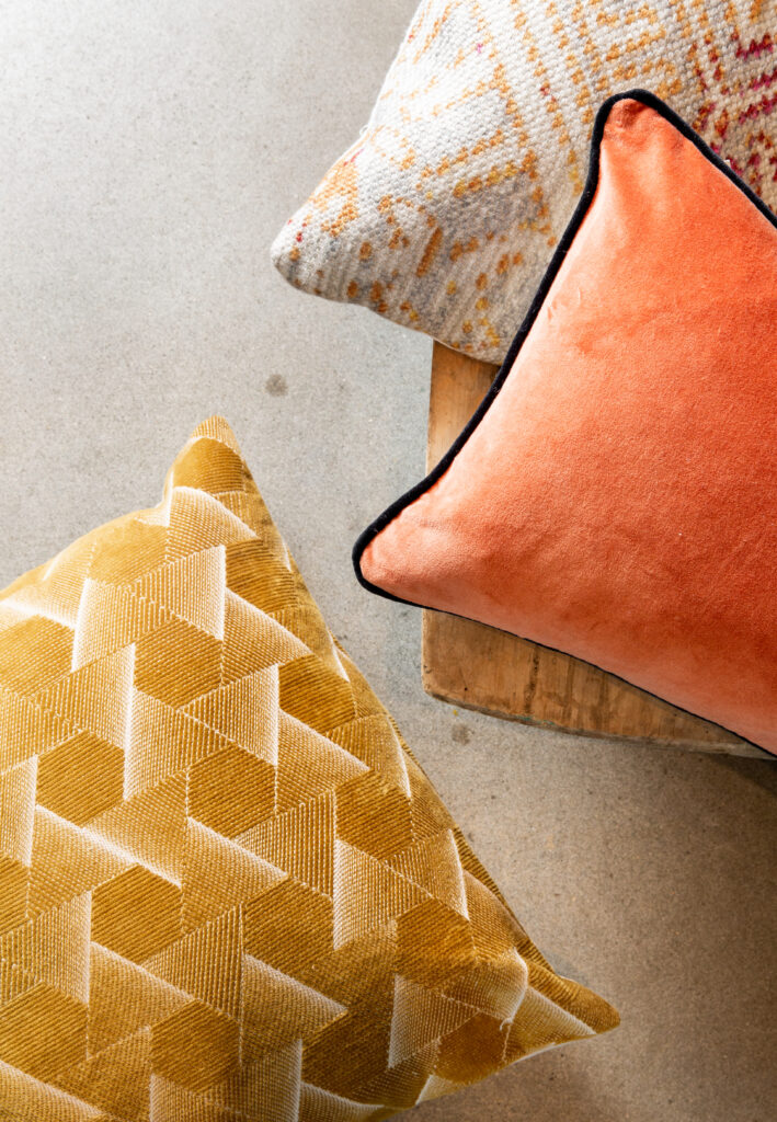
Jaipur Living‘s pillow offerings include an array of colors, textures, and materials, including the Groove by Nikki Chu, Nouveau, and Emerson collections.
Common Mistakes
The most common mistake seen with home goods is not being intentional with them. “Accessorizing is essentially painting a picture with pieces, and we go into each event with a theme in mind,” says Hojnowski. This approach allows the Shannon Paige Events team to collect the accents that help tell the room’s story and complete the vision. “Selecting each piece with the purpose of making the scene helps to prevent the accumulation of ‘stuff,’” she says.
One pet peeve of Austin’s is too many picture frames. “It’s a common mistake,” she says. “I love some family photos, but I encourage my clients to cull down the quantity and try blowing up favorites to hang them on the wall. By making them big and important, you’re emphasizing quality over quantity,” she notes.
See also: 3 Design Pros Reveal Their Most-Asked Client Questions
Another common mistake? Using every inch of the surface. Austin prefers small groupings of three interesting pieces and coffee table books for stacking and leaning.
However, there are no rules when it comes to one of Austin’s favorite ways to incorporate texture: pillows. “I’m not sure you can ever overdo pillows! The more the merrier,” she says. “They’re a fun way to spruce up a simple, plain piece of upholstery or a white bed.”
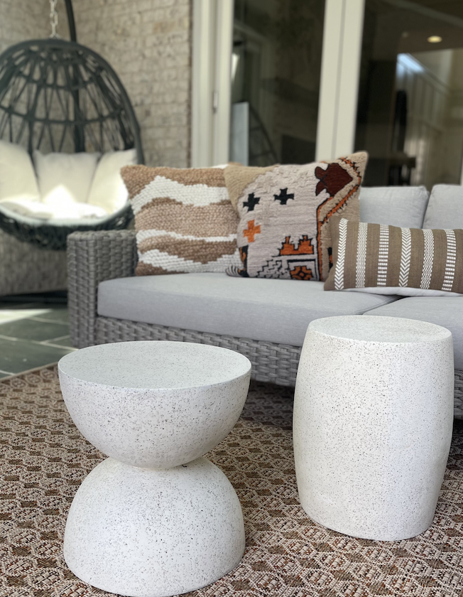
Interior designer Hope Austin showcased the Soul Trek collection in this outdoor space. Photo courtesy of Hope Austin LLC
Switch It Up
Austin has staple accessories that have dedicated places in her home, but the designer does like to switch things up seasonally. “In the spring, I love accessorizing with fresh flowers, and in the winter, I like adding texture with new pillows or throws on a sofa.”
DeBord and Hojnowski also nod to the delicate balance between constantly refreshing and bringing in new things and using the accessories that you originally intended for the space. “We both enjoy rotating and refreshing frequently, but it can be a tricky thing,” says Hojnowski. “We firmly believe in giving new life to each piece when creating different event spaces.” For this duo, when an accessory stops telling the story they’re trying to convey effectively, it’s time to move on. “When your eyes stop noticing the little things, it’s time to switch them up and rotate items,” she recommends.
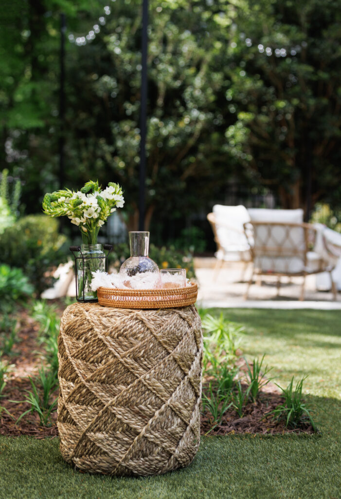
Jaipur Living‘s Scandinavia pouf takes center stage in this vignette from Shannon Paige Events. Photo by Lauren Chambers
Get the Look: DeBord and Hojnowski’s picnic for Atlanta Homes & Lifestyles’ Southeastern Showhouse
1. “The Saba poufs were the gem in each setting,” says DeBord. “The fibers on each pouf vary in color, allowing them to take on different shades in each setting to blend with the design better.”
2. “Layering and color were our biggest friends throughout this project. The handpicked rugs, such as Swoon, Cerles, and Chateau, paired effortlessly with the chosen poufs,” says Hojnowski.
3. “We loved using indoor/outdoor rugs that matched perfectly with the Sundial pouf and Spectrum Rays poufs,” says DeBord.
4. “The Scandinavia pouf was the perfect addition to the space and was exactly what we needed for the cocktail station,” says Hojnowski.
For more on Jaipur Living‘s cameo at 2022’s Southeastern Showhouse, view Instagram, or learn more here.
Next story


